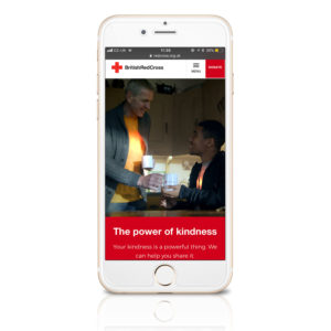
 The British Red Cross helps millions of people in the UK and around the world get the support they need if crisis strikes. However, over time, its website had become outdated and unreliable, with people unsure where to find the information they needed and confused about the organisation’s purpose.
Head of brand and strategic marketing at British Red Cross, Gemma Hamilton, explains: “Our old website hadn’t been updated for about seven years – when we evaluated visitor traffic we found 59 per cent of pages hadn’t been used for over a year. People go on the web having an idea of what they want to achieve, whether that be to donate money, to find out about volunteering or to access first aid advice, and it is our role to make it as easy as possible for them to do that.”
Digital Experience
As part of the charity’s digital transformation, British Red Cross enlisted Rufus Leonard to develop a website that met with growing user needs and create a digital experience that clearly showcased the ways in which the British Red Cross puts kindness into action.
In particular, a mobile-optimised, more responsive site was required to support the 50 per cent of incoming volunteer applications that originate from mobile devices and to enable people to access services and advice in emergency situations. The website was inspired by the development of the British Red Cross’ new brand strategy and promise of ‘connecting human kindness with human crisis’ with marketing campaigns designed to drive fundraising.
Central to Rufus Leonard’s approach was the ambition to help people understand and connect with the British Red Cross movement itself by communicating the charity’s true purpose. To accomplish this goal, the website was tasked with conveying the full range of support services that the charity provides. With content that promotes clarity and uses storytelling to motivate action, Rufus Leonard made the new experience inclusive and accessible – this included ensuring a seamless mobile experience.
“Less is often more,” says Darrel Worthington, chief experience officer at Rufus Leonard. “Simplicity and clarity are crucial for any brand website when it comes to delivering a good brand experience. Critically, the experience must be inclusive and accessible across devices. Put the user first and keep the journey as frictionless and simple as possible. Ensuring the CMS and technology infrastructure is optimised before embarking on outbound marketing will mean greater ROI all round – not only will you see conversion increase, but you’ll also see greater loyalty and social sharing as a result of a great user experience.”
User Testing
Building on the British Red Cross’ extensive user-testing, conducted with over 900 users, the digital user experience has been comprehensively streamlined. Rufus Leonard enabled the transformation by organising, re-structuring and labelling content in a way that would help people find information and complete tasks quickly, rationalising 4,000 pages down to 350 and consolidating 74 services.
The principle method was to keep page weight low and ensure that all images had a clear purpose. With the newly defined brand strategy in place, Rufus Leonard made use of simple iconography, supported by impactful statistics and clear call-to-actions, to create a more personal look and feel for the British Red Cross.
“We worked closely with Rufus Leonard to make our user experience both inclusive and accessible, with our brand vision front of mind,” says Hamilton. “Our new website doesn’t just talk about our services – it’s actually a service in itself. For example, at the top of the page we have tabs like ‘Get help’, ‘Get involved’ and ‘Shop’, meaning it’s very much geared around what an individual might want to do on the site. By building a website that focuses on the needs of visitors and ensuring that we understand how people are using the website currently and how they might like to use it in the future, we are able to make those pathways as easy as possible, which helps us to drive donations.”
As a result of Rufus Leonard’s work with the British Red Cross, the charity is able to monitor how users interact with its new website more effectively and quickly adapt these insights to inform and shape a web user’s experience. This has included introducing a new feature on the site called ‘Is this page useful?’ at the bottom of every page, inviting users to inform British Red Cross if each element of the content is relevant.
Hamilton also stresses the importance of a website that aligns with other digital channels.
“It’s about building insight and an understanding of audiences and having a presence wherever they are. It’s about having a consistent and coherent offering that people recognise across channels, which in turn means they are motivated and able to contribute in a way that suits them.”
Source: Mobile Marketing Magazine

You must be logged in to post a comment Login