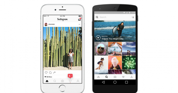
 Instagram has refreshed its branding, debuting a new logo and app design to position the platform as “vibrant and diverse” storytelling hub.
The Facebook-owned app’s trademark Polaroid-like, colourful camera icon has been given a minimalist makeover. However, the ‘rainbow’ element of the logo lives on in gradient form while a simplified shape has been created to reflect a more versatile camera.
Additionally, Instagram has aligned the identities of each of its sister apps, Layout, Hyperlapse and Boomerang, using the same palette to colour each and unify the product family.
Instagram’s new logo, and the new icons for Layout, Hyperlapse and Boomerang
The change has been initiated in order to reflect the platform’s 400 million-strong userbase, according to Instagram’s head of design Ian Spalter who said that the old icon was “beginning to feel, well… not reflective of the community, and we thought we could make it better.”
A modern new interface design has also been implemented to put more focus on photos and videos without changing how users navigate the app. The black and white monochrome look was first hinted at a few weeks ago when the social giant tested it on several users.
According to Spalter the new front end was developed around the concept that “colour should come directly from the community’s photos and videos”.
Though fresh logos are often met with resistance from users, Instagram said its hope is that people will see the icon “as a new creative spark — something to have fun with and make their own.”
Source: The Drum

You must be logged in to post a comment Login