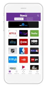
 Roku has revamped its app for both iOS and Android devices to include new look, simpler navigation and updated on screen remote.
The new navigation bar sits at the bottom of the Roku app and enables the user to view and launch installed streaming channels, browse what’s on, use the remote, and share photos and videos to the TV.
 On app launch, users are presented with a scrollable view of their streaming channels. Once a channel is selected, the remote control will automatically appear on the app.
“We know that getting to the channel you want is only the first half of streaming the content you want to watch,” said Matthew Wee, senior product manager at Roku, in a Roku blog post. “Now you can quickly go from deciding where you want to watch to finding what you want to watch without additional taps.”
In addition, the app features an updated on screen remote to more closely match the buttons on the Roku device remote. The remote also now features a channel icon to access streaming channels.
Source: Mobile Marketing Magazine

You must be logged in to post a comment Login