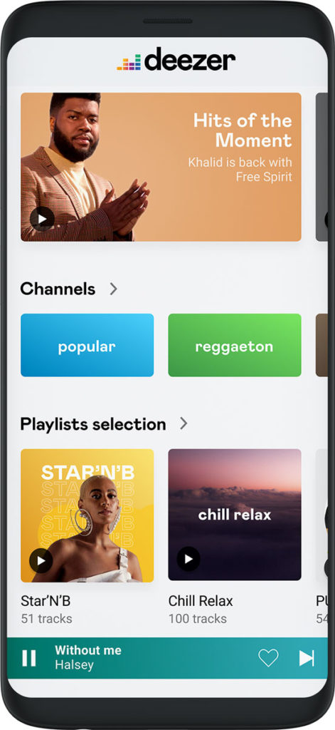
Deezer, the global music streaming service, has updated its app with a new look and feel that highlights the brand’s human and local identity.

Deezer continues to evolve its light and accessible app design to make it easier than ever for users to navigate the world’s most diverse audio content library.
The app has been revamped to have more space, less text and dedicated visual treatments for playlists and channels. Deezer’s new player also matches its colour to the cover art of the current track for a truly personal user experience.
By providing a light, functional and playful interface, Deezer wants to become the soundtrack to its users’ lives and to help music listeners become music lovers.

The new visual identity highlights Deezer’s ambition to provide users with the most comfortable music streaming experience on the market. The updated app wants to gently nudge people out of their musical comfort zone and broaden their horizons.
Deezer fans will also notice that the logo has been updated to match the new personality of the brand. It embraces Deezer’s heritage as an industry innovator and updates the iconic equaliser for the digital age.
The new font, Mabry Pro, ties together Deezer’s brand and customer promise with its friendly, joyful and trustworthy look and the lowercase logo treatment aims to convey a human and personalised approach.
“We want to bring users a modern and human service that stands out from anything else on the market. Our unique look and feel also reflect our mindset as an industry challenger. We help our users create the soundtrack to their lives by bringing them the music they need for any moment,” said Hans-Holger Albrecht, CEO Deezer.
Users can now enjoy Deezer’s new look and feel by logging into the service at www.deezer.com or by updating the Deezer app on their mobile phone.
Source: Deezer

You must be logged in to post a comment Login