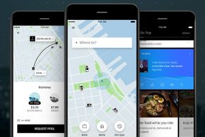
 Uber has revamped its app, streamlining the intricacies of its ride sharing service into a single question for riders: ‘Where to?’.
It’s the first redesign the app has received since 2012, and Uber acknowledges that since then it has suffered from feature bloat, becoming ‘complicated and harder to navigate’. This update is intended to strip the app back and recapture the ‘clean and simple aesthetic of the original Uber experience’.
In place of the app’s previous homescreen, which presented the full range of car options Uber offers up-front, the app now starts with a ‘Where to?’ search bar, only asking whether they want to travel in an X, XL or Lux car once the destination has been chosen.
The app also promises to learn from users’ routines, offering ‘shortcuts’ that predict their destination based on previous journeys and – in a yet-to-be-launched feature – straight from the users’ calendar if they connect the two apps.
This isn’t the only feature Uber is planning to add. Users will be able to choose one of their contacts as a destination by inviting them to share their location, and the app also intends to expand relevant content – including Yelp reviews, transit times, exclusive Snapchat filters and its own UberEats delivery service – that can be accessed en route.
The app will roll out globally ‘over the next several weeks’ on both iOS and Android.
Source: Mobile Marketing Magazine

You must be logged in to post a comment Login