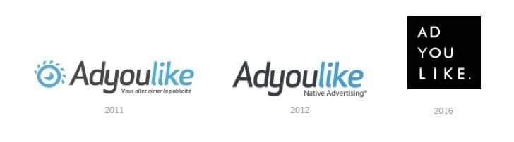
Native advertising technology company ADYOULIKE, has announced a complete brand re-launch, including a new logo. The rebrand is the latest move by the company as it experiences hyper-growth globally.
The new branding better aligns the company with its international expansion and global growth objectives for 2016.
ADYOULIKE has pioneered native advertising in the European market since 2011 and has been at the forefront in the development of programmable native advertising – one of the fastest growing channels in advertising today.
Included in the rebranding effort are a new logo, website, agency and publisher marketing collateral. Event and marketing partnerships to promote the rebrand are soon to be announced.
Julien Verdier, CEO and co-founder of ADYOULIKE;
“I am proud of this new logo which manages to translate our mission and our strengths. Native advertising is the future of advertising, and we are creating and developing powerful technological advancements that can ensure its expansion.
“Our award winning native technology and continued innovation allows publishers and advertisers to run truly engaging, creative, non-interruptive native advertising campaigns at scale. We wanted our logo to reflect this innovation on a global level.”
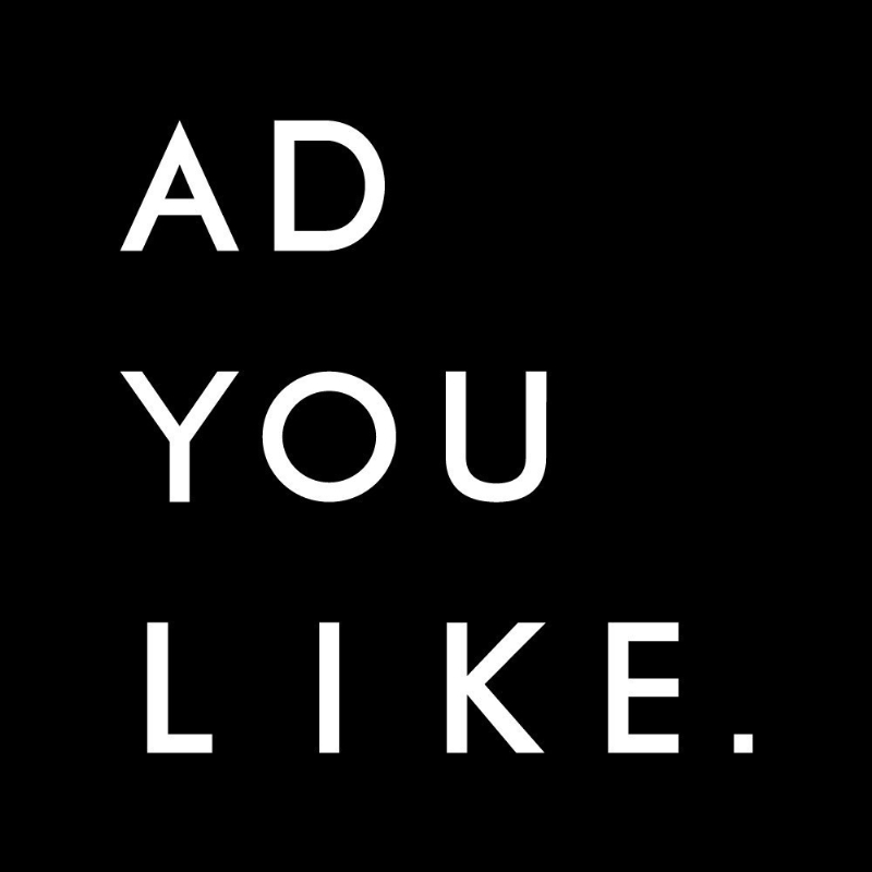
This new visual identity was created by Elie Majorel, Head of Design at ADYOULIKE in what he describes as “a new logo that underlines technological strength with sobriety.”
The new logo offers direct access to the DNA of the ADYOULIKE brand, focusing on the business name. These values can be summarized as follows:
– AD: the innovative technology transforming the digital advertising market.
– YOU: the human dimension through content strategy, exceptional service and expertise.
– LIKE: an advertising experience deeply native, which respects the user.
Comments Elie Majorel, Head of Design at ADYOULIKE:
“To underline the strength of its proprietary technology, the new ADYOULIKE logo gives off strength and control thanks to its square shape, the pyramidal disposition of the letters and the definitive affirmation given by the final full stop in the design.
The elegance and simplicity of the black and white are the promise of unique advice and expertise from a native advertising pioneer. A discreet allusion to the feed, thanks to the verticality of the words and the point referring to the URL, remind that ADYOULIKE is a digital start-up.”
Source: ADYOULIKE
Native Advertising Technology ADYOULIKE Launches New Brand Identity added by Newsroom on
View all posts by Newsroom →
You must be logged in to post a comment Login